Lighting as an attentive attribute in KPI dashboards
/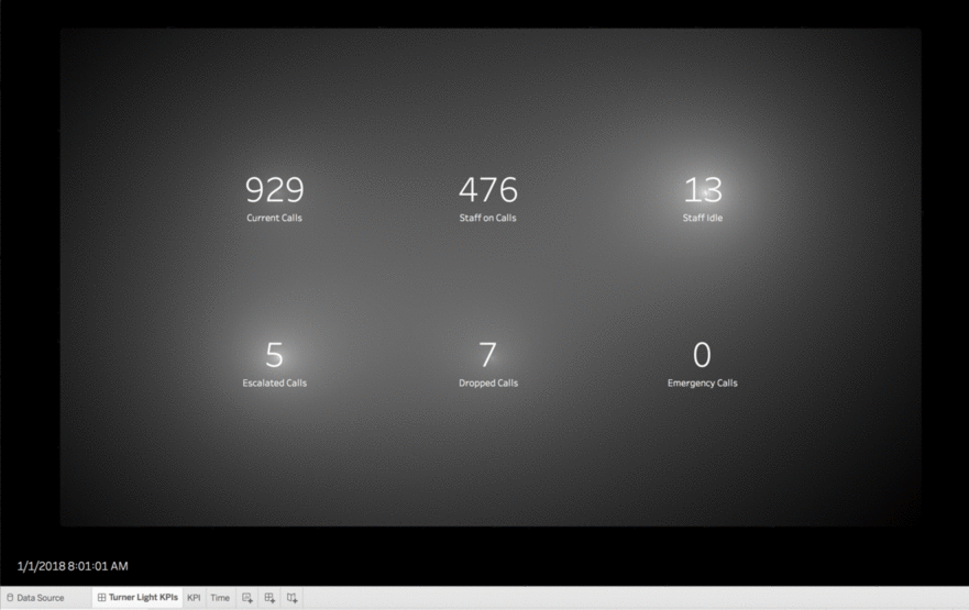
I have been mulling over his technique of using broadly applied atmospheric washes of paint to draw focus and create intensity, and how to apply it to data visualization. We usually use the attentive attributes of color, size, shape, position, etc. to draw focus in dashboards.
I have been spending a lot of time pondering the UX of things not related to data viz and asking how to apply those design ideas to visualization work, as with my widget post. Outside the sphere of data viz, in everything from photography, to video games, and interior design, lighting is a powerful way to draw focus and create emotion. I wanted a Marks card with a "Lighting" shelf.
Read More


