Tableau Ambient Widgets - the tiny, moody, & relevant data experience!
/See that in the lower left corner? That would be a live updating Tableau Dashboard as a desktop widget on my Mac. I can keep an eye on things while getting important work done. :-).
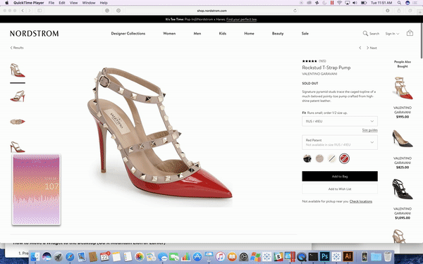
Almost as hot as those shoes right?
Why did I make this? After school and work my kids and I talk about our day. Sometimes feeling particularly proud of myself, I will show off some dashboard that I have been working on, only to get a "meh" from my kids.
Annoyed with the tween eye-roll, I asked Max what he thought was a cool dashboard? He fired up Star Wars Battlefront, and then Halo 5 on his Xbox to show me how the "youngs" think data should be consumed. While in the process of battling the "Dark Side", Max kept a constant eye scan on the little floating widgets which let him know key things such as the weapon he was using, the position of his team & the opposing team, his health level, etc.

This got me to thinking about the standard user experience of getting to a dashboard. The user experience is:
purposefully stops whatever work they were actually doing
logs into a server or portal
browses for a particular dashboard or view
get what they were looking for
close the view
go back to work
I wanted to create an experience more like Battlefront, so I can keep an eye on key data while they are happening. Could I just create small widgets for my desktop that would keep me up to date while not interrupting my workflow? The updated experience would be:
glance left
Create a Widget and move it to your desktop on a Mac:
I googled desktop widgets for the Mac and found you could create a "Web Clip" widget from any webpage. I tested out this using the Polar Clock created by Chris DeMartini with an animation trick by Allan Walker.

You can then move the widget from your Mac dashboard to your desktop with this easy to follow step by step guide.
Animation:
Taking advantage of the same technique for animation as used in the Polar Clock, you can use comparisons from a time field in your data to the current time minus how far in the past you want to show in your dashboard. Mine for example just shows the last 60 seconds. Once you have pubished your workbook, you can add it to a webpage and animate it with Allan's code. Just swap out your published viz for the Calls one below:
<!doctype html>
<html lang="en">
<head>
<meta charset="utf-8">
<meta http-equiv="X-UA-Compatible" content="IE=edge">
<meta name="viewport" content="width=device-width, initial-scale=1">
<meta name="description" content="Tableau Desktop Widget">
<meta name="author" content="Allan Walker, Anya A'Hearn, Jonathan Drummey">
<script src="https://public.tableau.com/javascripts/api/tableau-2.0.0.min.js" type="text/javascript"></script>
<script src="https://code.jquery.com/jquery-1.10.2.js"></script>
<style>
.middle {
margin: auto;
position: absolute;
top: 0;
left: 0;
bottom: 0;
right: 0;
width:204px;
height:370px;
}
.bannerhide {
width: 204px;
height: 300px;
overflow: hidden;
}
#tableauViz1 {
width: 204px;
height: 369px;
}
</style>
</head>
<body>
<div class="middle"><div class="bannerhide"><div id="tableauViz1"></div></div></div>
<body>
<script>
var viz, one, workbook, activeSheet, Worksheet, worksheet;
$(function() {
var onePh = document.getElementById("tableauViz1");
var oneUrl = "https://public.tableau.com/views/CALLS_0/CallstoCallCenter?:showVizHome=no&:display_spinner=no&:jsdebug=n&:embed=y&:display_overlay=no&:display_static_image=yes&:animate_transition=yes";
var oneOptions = {
width: "100%",
height: "100%",
hideTabs: false,
hideToolbar: true,
onFirstInteractive: function() {
clock();
}
};
viz1 = new tableauSoftware.Viz(onePh, oneUrl, oneOptions);
});;
function clock() {
viz1.refreshDataAsync();
setTimeout(clock, 5000);
}
clock();
</script>
</html>
Mood Lighting - the ambient background:
Of course, this is a DataBlick widget, so it needs more glitter!!!! My widget was for the number of calls from LA 311 (thank you Allan for finding the data), I wanted to have the background of my widget update its background color with an ambient mood gradient depending on if the volume of calls was in one of 3 ranges (alert!, a bit on the high side, or mellow). Initially, I thought of using a view swapper or changing the background image based on a value, but I have other devious ambient lighting plans, so I wanted to start to play with it as pixels.
To do this, I created a very simple sheet with a pixel for every combination of X (0-100) and Y (0-100) to use to create my "moods". Bringing this into Tableau as the primary sheet, I could create a gradient easily by putting [X] and [Y] where they usually go, and [Y] on color. To blend in the call center data, the datetime and number of calls needed to be converted to match the axis of the mood grid. I called Jonathan Drummey to pick his brain on the best way to do this. To join the data he created a time field off of NOW():
[Mood].[Live DATE Second]
DATEADD('second',-60+[X],
(DATETRUNC('second',NOW())
))
This was joined to a similarly named field in the Call Center data source:
[Calls].[Live DATE Second]
DATETRUNC('second',[LIVE DATE])
The columns uses the [X] from [Mood].[Live DATE Second]. The dual axis of Rows is [Y] *1.0 for the first axis and an Interpolated value for the Number of Calls to scale it on a 0-100 scale. We used 366 * SUM([CallCenter].[Number of Calls])/1000, but you would normally use whatever your expected highest value instead of the 366, or your Max value in your data set. More on my 366 below.
I now needed 3 color gradients for each of my moods. To create this, Jonathan pointed me to a blog post by Keith Helfrich.
I wanted 3 moods with 3 colors each, plus I needed a break in the middle of each mood for 11 colors in total. with each color as 9.09...% of the range.
From Jonathan:
range of 1-100 + palette cleanser(s)
100 * [# moods] + ( 100 / [# moods] * ([# moods] - 1)
color value
[Y] + 100 * ([mood] - 1) + ( 100 / [# moods] * ([# moods] - 1) * ([mood] -1))
mood 1
1 -100
mood 2
Y + 100 + 33.333 = Y + 133.333
mood 3
Y + 266.7
+ the 100 is my 366 number from earlier!
My preference .tps file was updated with the below to make my moods:
<preferences>
<color-palette name="Ambient3" type = "ordered-sequential">
<color>#d883de</color>
<color>#664ebf</color>
<color>#152aa9</color>
<color>#FFFFFF</color>
<color>#d883de</color>
<color>#fbb286</color>
<color>#ff78d0</color>
<color>#FFFFFF</color>
<color>#f9bc70</color>
<color>#f97e3f</color>
<color>#fa4d17</color>
</color-palette>
</preferences>
I thenk created a [Mood of Calls] field to define the ranges:
IF [Latest Number of Calls] < 100 THEN "1"
ELSEIF [Latest Number of Calls] < 120 THEN "2"
ELSE "3"
END
and then a [Y by Mood] field to drop on Color:
CASE [Mood of Calls]
WHEN "1" THEN MAX([Y])
WHEN "2" THEN MAX([Y]) + 133
WHEN "3" THEN MAX([Y] )+ 266
END
I then used my newly created Ambient palette, and fixed the start and end to 0 and 366. here it is below in Tableau before putting it in the widget candy coating, and a link to it on Public:

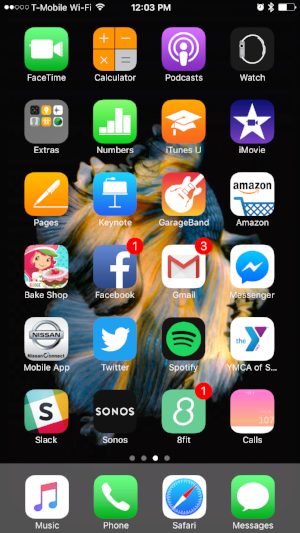
I even looked into making it an app on my iPhone which you can do from any "web clip" as well, although I need a better Icon:
A big bummer caveat is that if it is on Public your widget will time out eventually, so this would work much better on your own Server, at which point, security will most likely be a concern.
All said I am having fun playing with creating UX like this, and other "out of the dashboard box" explorations of data consumption, and you can bet that by TC17 Allan and I will be showing off some other crazy town fun we have been working on.
