#Data16 Twitter Network Project

#Data16 Twitter Network Project

For this year’s conference I undertook a project with Keith Helfrich to harvest tweets tagged with #data16.  We collected the tweets regularly throughout the week, and updated a view of high level summaries and detailed network visualizations.  This post details some of the highs and lows that we came across, and provides access to the workbook so you can do your own analysis and review as well. Please also be sure to check out Keith’s post on the same subject here.

Read More

#DATA14 Presentation: How to Create a Viz that Stops Traffic

#DATA14 Presentation:  How to Create a Viz that Stops Traffic

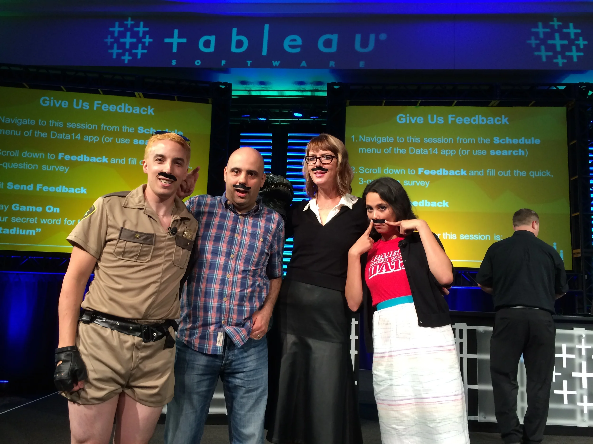
I had a wonderful time presenting at the 2014 Tableau Conference, along with Daniel Montgomery and Paul Banoub on "How to Create a Viz that stops Traffic.  The session was hosted by the amazing talented Jewel Loree.  Below is the presenation

Read More

Using Design and Emotion to Create a Data Visualization with Impact

Using Design and Emotion to Create a Data Visualization with Impact

This is the slideshow from my session at the Tableau 2013 Customer Conference.  This session will walk through the process of creating a data visualization based on product design principles and ideas, focusing on overall product goals and user context. A step by step walk through of the design process for two data products, "Twitter TV Set" and "Firework Injuries" will be used as examples to highlight the impact that design and emotion can add to a visualization.  

Read More