Dashboard Drama - From Flat to Fabulous!
/Anya A’Hearn & Noah Salvaterra
Link to workbook on Tableau Public.
If we consider ourselves storytellers of data, then we should always strive to make those stories more engaging. Taking a cue from movies, photography, and stage, lighting can draw attention to the most critical components of a story. Directing focus is often relegated to minor visual cues such as a dot at the end of a sparkline, or an up and down arrow colored by good vs bad. Instead of being adornment that distracts from the story, this use of “white space”, focuses attention. We hope this lighting technique adds an enhanced user experience by conveying the drama of a KPI’s deviation from the target’s impact on your organization.
The tried and true recipe of:
what are your KPI’s current values?
where are they vs target?
is this a trend?
what is this attributable to?
is very effective, but a bit basic.

This post is the evolution of a previous post Lighting as a pre-attentive attribute in KPI dashboards. At the time, there was no sheet transparency in Tableau, and so the initial iteration was only the KPI’s with lighting. In the new version, freed from the dual axis limit, the lighting follows the most current value on the KPI sparkline instead of just being fixed behind the KPI and allows for a more detailed dashboard in the foreground.

To rehash the premise a bit, in a typical dashboard, there is no indication of how a metric’s deviation from a target has an impact on the business. Is it critical or not? All KPI’s fluctuations are not the same, and so an increase in one emergency call is more critical and has a larger impact than one call center employee being on idle for a few minutes. From a usability standpoint, in traditional dashboards, we are asking the user to look at the KPI, its deviation from expected, and interpret the impact of that deviation based on learned or derived subject knowledge usually not present in the dashboard. Our dashboard with lighting takes into account the level of critical impact and adds the visual cue to look here and care about it now. Stuff is going down!!!

User Interaction:
The user sees an indicator of a good or bad value (mark color/position). The user looks at the value of KPI, how far away it is from the target, and if it is sudden or has been trending that way.
The user bases knowledge of KPI acceptable rates to interpolate the criticality of the current state of the KPIs.
The user Investigates further and takes action.
Initial Setup:
The user defines KPI’s, their target values, and if a KPI is above or below the target it is “good” or “bad”.

User Interaction:
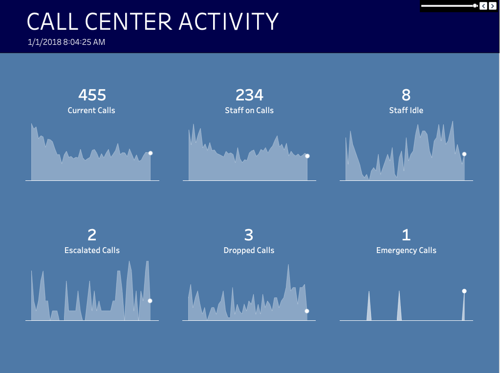
The user’s eye is immediately directed to something of critical importance. There is an emergency call demanding my attention, quick react now! The Staff on calls is low as well and that could affect the ability to handle the emergency.
The user Investigates further and takes action.
In the absence of any values that are defined as critical, the dashboard would be a single color or have minimal lighting letting the user know with a simple glance that all is going okay.
Initial Setup:
The user defines KPI's, target values, and the impact of that KPI being at different deviations from that target. This could be linear, curved, stepped, both in the negative or positive direction. Based on one or multiple KPIs in conjunction being far away from the target.
Calculating where the KPI for that time slice is on the grid on the background sheet to use as the center of the lighting for each metric.
Who wouldn’t want a dashboard that tells you where to look? It’s beautiful, engaging, and is easy to scan and understand and react to what is critical. Here is how to:
Modifying the previous lighting post, we needed to change the location of the lighting to follow the end of the sparkline instead of being fixed. To do this, create a duplicate sheet of the background lighting and float it over the dashboard. Now if you hover over the chart, you can get the Min and Max X and Y values for each of the charts locations on the grid of points that will be in your background creating the lighting.

The Min X and Y are added to the source file as the origin points for each of the metrics. We used Alteryx to capture the Min and Max values of our time ranges (the X-axis) to create a timespan, and the range of values for each KPI (the Y-axis). We also use the workflow to calculate the criticality metric of the KPI’s deviation from the target.
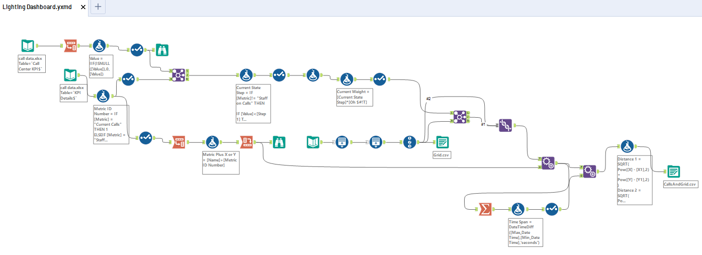
Back in Tableau, we can determine where our point is on the sparkline by interpolating the X and Y values relative to the fixed Min and Max X and Y’s as shown below:
We then determine where the point is on the grid using the slope of the line to make it the center of the lighting.

The colors were selected were for the maximum drama to make a point. They were inspired by Spider-Man: Into the Spider-Verse, where the colors were simply jaw dropping the entire film.


But this works as well for more subdued colors. The below uses the out of the box Blue-Turquoise Tableau colors. Even this subdued version of this lighting adds the ability to draw the user to focus on the critical KPIs instead of being flat.
No lighting

With lighting to indicate criticality
After the original lighting post, many people tried to replicate it with using an increasingly transparent .pngs to create the lighting instead of creating a calculated radius based on the criticality of all KPI’s. It simply does not look anywhere near as good. Good luck trying to get a png to work to match this lighting magic :-).
We hope you enjoy and want to enhance your dashboards with drama! DataBlick is excited to help you take your dashboards from flat to fabulous.
