Mobile Accordion - easy access to details
/Many of the mobile applications that I use have accordion-style navigation to allow me to quickly pop up additional details if I want to investigate something further, like stock activity if I see a price suddenly jump or fall. I wanted to add this interactivity to my Tableau mobile dashboards, and now with parameter actions, we can.
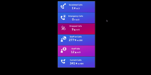
To create this, I started with the call center data that I used in my previous posts on adding a focus based on the criticality of a metric. You can find those here: Lighting as an attentive attribute in KPI dashboards, Dashboard Drama - From Flat to Fabulous!, Feeding the screen-time beast with shifting mobile metrics. The main idea is to color code the metrics by their current state’s criticality. I borrowed gradients from this post in the current version.
To create the accordion, I used 12 different views/containers all in one vertical container (one for each of the KPI’s (or whatever you want your top half to be), and one for the bottom half detailed view(s) so that it would pop out below. These are all actually transparent sheets with the marks all colored white. This is incredibly annoying to work with so while you are building it, you can make the color something and then switch to white when you are done building the viz. I did add a continuous MIN(1) pill to all of these in the rows so that Tableau would size the tops and bottoms the same. Otherwise, the ones with the green pills would take up a lot more room squishing the KPI’s. You also have to remove the 4px outer padding that is added by default.
Behind this big vertical container, there is another vertical container also with 12 views with the backgrounds to match each of the tops and bottoms. The colors in the background are just an image that I swap out based on the metrics’ current criticality score. You could be a bit less glam and just use a solid color too. You could also combine the backgrounds and foregrounds if you are feeling crafty and not have the stacked layers.

I wanted the gradient to be smooth when the top and bottom of a metric were opened so I split a background image in half vertically for each of my 3 criticality levels.
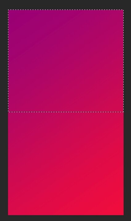
To add a different background image to both the top and bottom based on the criticality scores, I duplicated the data set so there could be one image for the top’s H, M, L and one for the bottom’s H, M, L for a total of 6 images, 3 for each data source. I then built views just for the backgrounds:

These are behind the vertical container with the 12 KPI/detailed views.

Now for the interactivity. Create a Parameter for the Metrics (this is a tall data set so that is a name of a dimension). Leave it as blank. Add a filter to each bottom sheet that Metric = the Selected Metric parameter. They should all be hidden as the parameter is blank. Create a parameter action for the top views so that when you click or hover on a KPI, the Metric name is used to “pop-out” the bottom view. Clear the parameter value before you publish so the initial state is with no pop-outs.

That’s pretty much it, except that I was annoyed that Tableau was highlighting the selected KPI. I happened to kvetch to Jonathan Drummey who said he was working on just the thing. But I will let him blog about that one - nudge, nudge. If you want a peek, you can just download the workbook below. It looks a bit wonky on Public but great in Presentation mode on Desktop. I hope that can be fixed Tableau…
Enjoy!
