A Tableau Accessibility Journey - Part III - Color Contrast and Font Size
/This post is a continuation of A Tableau Accessibility Journey - Part II, which discusses how to set focus order correctly in your Tableau visualization. The first part of this series includes a number of accessibility issues that were identified in our case study visualization, and this post will focus on trying to address this issues of color contrast and text size identified in part one.
Color & Text Contrast
Let’s check WCAG 2.1 again to look into what we need to be thinking about from a color and text contrast perspective. I have references to each detailed section below, the summaries herein are adapted from WCAG’s main requirements.
1.4.1 - Use of Color: Color is not used as the only visual means of conveying information, indicating an action, prompting a response, or distinguishing a visual element.
Techniques to help with 1.4.1:
G111 - Using color and pattern: The objective of this technique is to ensure that when color differences are used to convey information within non-text content, patterns are included to convey the same information in a manner that does not depend on color.
G14 - Information conveyed by color differences are also available in text: The objective of this technique is to ensure that when color differences are used to convey information, such as required form fields, the information conveyed by the color differences are also conveyed explicitly in text.
1.4.3 - Contrast (Minimum): The visual presentation of text and images of text has a contrast ratio of at least 4.5:1.
1.4.11 - Non-text Contrast: The visual presentation of the following have a contrast ratio of at least 3:1 against adjacent color(s).
Techniques to help with 1.4.11:
G209 - Provide sufficient contrast at the boundaries between adjoining color: When selecting colors for graphics with multiple colors, consider adjoining colors and test that the contrast ratio is at least 3:1. If adjoining colors have less than 3:1 color contrast ratio difference add a border with at least a 3:1 color contrast with each color.
Use Case Failures Related to Color Contrast
A quick look back at the high level failures from my case study visualization and we have these findings to look into.
Low contrast on chart elements and text - Fail (I have text with less than 4.5:1 and geometry with less than 3:1 contrast)
Text size to small - Fail (I have text which renders less than 12px on Tableau Public)
Information only available visually - Fail (There are many chart elements that cannot be understood if you are not using your sight)
Text Contrast
In order to test the contrast of my text against my background (white, #FFFFFF), I used a color contrast plugin for chrome (but there are many tools out there, including WebAIM’s Contrast Checker), against the case study visualization on Tableau Public. Here is an image showing how that worked. This image shows the eye dropper being placed on my title text and then the plugin calculates the contrast ratio based on entered foreground and background color.
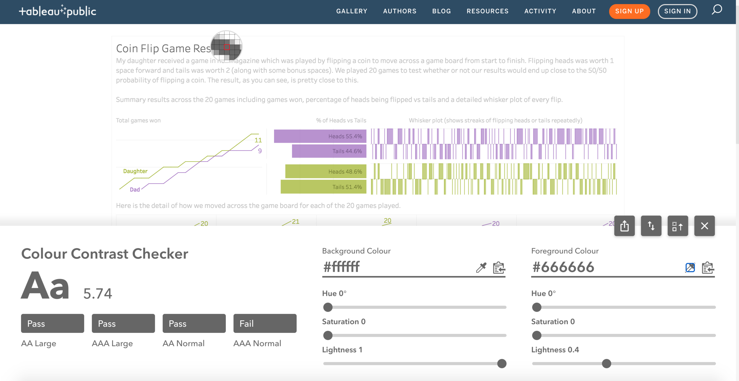
This figure shows the use of an eye dropper tool to select the color of title text and calculate it’s contrast against the background color, in this case, white (#FFFFFF).
Shades of Grey:
| Type | Text Color | Background Color | Ratio | Result | New Text Color | New Ratio | New Result | |
|---|---|---|---|---|---|---|---|---|
| Title Text | #666666 | #FFFFFF | 5.74 | pass | #4d3771 | 10.0 | pass | |
| Sub Title Text | #C3C3C3 | #FFFFFF | 1.76 | fail | #767676 | 4.54 | pass | |
| Tooltip | #787878 | #FFFFFF | 4.42 | fail | #767676 | 4.54 | pass | |
| Game # | #d4d4d4 | #FFFFFF | 1.48 | fail | #767676 | 4.54 | pass |
Other Colors:
| Type | Text Color | Background Color | Ratio | Result | New Text Color | New Ratio | New Result | |
|---|---|---|---|---|---|---|---|---|
| Green Text | #a3b628 | #FFFFFF | 2.26 | fail | #40715a | 5.63 | pass | |
| Green Text in Bar | #6f7a2a | #b9c85c | 2.55 | fail | #FFFFFF (#40715a) | 5.63 | pass | |
| Purple Text | #a26dc2 | #FFFFFF | 3.82 | fail | #4d3771 | 10.0 | pass | |
| Purple Text in Bar | #705382 | #b990d1 | 2.45 | fail | #FFFFFF (#4d3771) | 10.0 | pass |
This is all a pretty easy fix, definitely a bit tedious, but we basically need to first check these ratios and then adjust the color palette of our visualization to meet these criteria. I will admit that my case study visualization is quite simple in this regard as I have three colors total (Grey, Purple and Green) and am not using color to convey scales of values either sequential or diverging. I could see meeting this requirement becoming quite a bit more difficult than it will be for me in this visualization. I will also note that I think meeting these contrast requirements is going to affect aesthetics for some visualizations that will make this revision very challenging.
Bar and Line Geometry Contrast
| Type | Text Color | Background Color | Ratio | Result | New Text Color | New Ratio | New Result | |
|---|---|---|---|---|---|---|---|---|
| Purple bar color | #b990d1 | #FFFFFF | 2.63 | fail | #4d3771 | 10.0 | pass | |
| Green bar color | #b9c85c | #FFFFFF | 1.83 | fail | #40715a | 5.63 | pass | |
| Purple line color | #a26dc2 | #FFFFFF | 3.82 | fail | #4d3771 | 10.0 | pass | |
| Green line color | #a2b627 | #FFFFFF | 2.45 | fail | #40715a | 5.63 | pass |
But wait! While these are the hex codes I set in Tableau, when I double checked on the viz on Tableau Public with the eye dropper checker I get different values! This was due to the opacity setting that I adjusted in Tableau, this has a significant impact on the contrast that is actually published online. So the lesson learned here is to double check with an eye dropper tool on the published visualization, as you may run into cases where the contrast ratios online are no longer meeting the WCAG requirements.
One other important call out here is WCAG’s technique G209, which points out that you can use borders to help meet the contrast requirements. This can be an extremely useful tool for us if we do prefer to use lighter color schemes which may not have at least 3 (for geometry) or 4.5 (for text) contrast to whatever background color you use in your viz.
Text Size
According to the audit results provided by Frank, I had some text which was rendering to small as well (less than 12px). To address this I went through each of the text objects on my dashboard and increased the font size to try and better meet this requirement. Again, this one could get tricky for more complicated dashboards and I may still have some work to do here as well.
Here are some ways that the developer experience could be improved within Tableau.
Having a built in color contrast checker would be a fantastic way to make it easier, but also remind people in the first place that they need to pay attention to these requirements when developing in Tableau. For this I created this idea, please upvote!
The ability to apply borders could be improved. We have limited options in Tableau for how we can set borders, so providing a bit more CSS like capability here would help us take advantage of technique G209.
I am sure there are more than what I have listed here.
Here are the additional posts created as part of this series:
