DIY Chord Diagrams in Tableau - by Noah Salvaterra
/
I am beyond excited to introduce the first (and amazing) "how to" blog post from DataBlick Partner Noah Salvaterra on the DataBlick site! In addition to working full time with clients, Noah has been instrumental in creating some of our unique service offerings, such as the Tableau Personal Training Program, and a Virtual Center of Excellence Program that we hope to announce by TCC15. If that wasn't enough he also recently lured both Joe Mako and Jonathan Drummey to the DataBlick team.
Noah has been called "ridiculous", for his ability to make just about anything happen in Tableau, as readers of Jonathan Drummey's Drawing with Numbers have already seen. This post is no exception. I knew this was cooking, and my jaw still dropped.
Thank you Noah!
-Anya

Can I make this in Tableau?… You can now.
Chord Diagrams are a chart that is often used for visualizing network flows that represent migration within a system, the one on the left for example, shows changes in cell phone choice for a collection of users. I’ll introduce the chart type a bit more carefully later, and provide a reference, but by the end of this post my hope is that you’ll have a sense of how you might build this type of chart with your own data in Tableau.
Joe Mako suggested the possibility that he will visualize the data from this post in a more effective way. I think that would be a great follow up and I certainly welcome that sort of feedback. I’m fine with the possibility that something better could turn up. The data underlying the chord diagrams in this post is included at the end. So feel free to have a crack at it. My opinion may not be that convincing on this topic, but the alternatives I’ve seen so far, such as stacked bars, heat maps or in the case of geographic data just throwing it all on a map and hoping it makes sense have their own problems as well. What I think most folks can agree on is that Chord Diagrams aren’t the right choice for every visualization. Searching the internet, I found more bad than good, so I chose the examples here with some care. My hope is that by enabling chord diagrams in Tableau, we can allow some experimentation and maybe establish some guidelines to know when it might be a good option, even if that answer turns out to be never.
Can I make this in Tableau? When it comes to chord diagrams I’ve seen a lot of responses that make me cringe. Chord Diagrams aren’t built into Tableau, and I wouldn’t expect them to be added any time soon, but lines and polygons are sufficient to make just about anything you’d like. Seriously… I’d like a Tesla, and here is the workbook. If it isn’t loaded yet, consider that I’m building a car in a data visualization tool, and quit reading so fast!
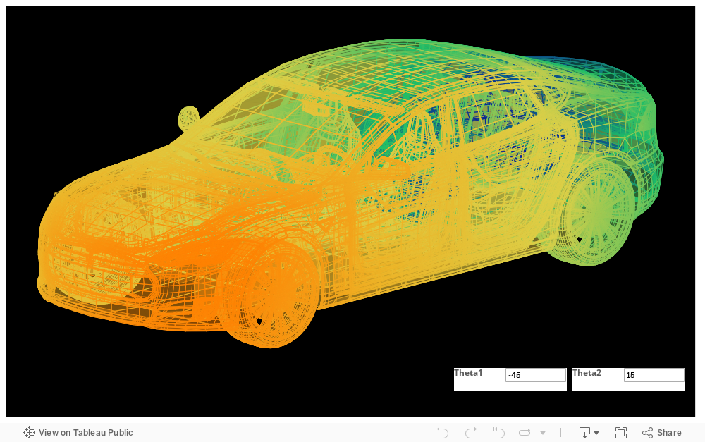
This workbook raises an interesting question in terms of best practices. The data underlying this workbook was parsed from a cad file. What data visualization best tells the story of this data? Should I go with a stacked bar chart or a scatterplot? BTW, if you’ve got your chroma-depth glasses handy, you’re going to want to grab them and download this workbook. I’m not going to go deeper into the techniques behind this workbook, it there is demand I could certainly do a followup to my original 3d post that that appeared on drawing with numbers. I’m hoping this workbook will make an appearance at Allan Walker and Anya A’Hearn’s Minority report talk at TCC15, somebody please save me a seat.
There is very little math in the Tesla workbook (OK, aside from the rotation matrices), but for the chord diagram I burned through a couple #2 pencils before I even began to build the workbooks in this post. Figuring out the underlying math isn’t for everyone, but I never doubted the possibility of creating this chart type in Tableau. If you just want a picture of a chord diagram, you’re probably better off getting it from Circos. Your workbook will certainly be a lot faster. A chord diagram may be too complex to take in all at once. Images of chords have graced the cover of more than a couple scientific journals and magazines, but such charts don’t usually do much for me, they may be beautiful, if that sort of thing does it for you, but they aren’t terribly illuminating. Interactivity is essential to this presentation, so if you work at one of those companies who pastes tableau screen captures into powerpoint, this probably isn’t the right choice for you. In practice, I’d be likely to pair this chart with one or two simpler charts that support the presentation and fill in some of the areas where the chord itself might be weak, for example a bar chart could show the aggregate picture, which should clarity any confusion from the donut and to assist with interactivity. As I sketched out the requirements for this project in my head, interactivity was at the top of the list. Chords and arcs should respond to hover and selection as they do in the D3 versions of these charts.
Another requirement, or maybe just a wish, came out of a conversation with John Edward Abdo, Founder and CEO of Palette software at last years Tableau conference. His idea was an app store for Tableau that could contain business specific visualizations, so frequently used chart types could be at your fingertips in seconds even if they weren’t included in the show-me menu out of the box. I liked the idea of being able to plug new visualizations types into the show me menu if the process could work seamlessly with Tableau. I got hung up on for a while on the idea of seamlessness, essentially dismissing the idea. I’ve done plenty of hacking in Tableau, but I wouldn’t even know where to start with hacking the show me menu. If any disgruntled developers want to help me out, call me. Short of that, Tableau would need to be involved in creating the infrastructure for such an exchange, and that assumes that opening show me to developers is even feasible. Still, the seed was planted and when I started thinking about chord diagrams, it started to grow. Creating a few chord diagrams in Tableau might be interesting, but after some initial novelty it would be about as useful as a Tableau Enigma machine. So I decided to think a bit on how I could create the workbook in a general enough way that the structure would be reusable by others. I’d like to find a way to generalize this further. I can’t promise to be available to support every issue that arises, that it will work in every situation, or with any dataset. But let me know if you find an issue or if you use it to make something awesome. I look forward to hearing from folks that use this post or have ways to push it further. Currently the structure of this visualization requires the granularity of the data to be at the level of cells in the transition frequency matrix. I think it could be pushed to work with finer granularity datasets directly by using LOD calculations. I decided to leave that on the table for now, if anyone wants to take a crack at that, please feel free to do it and let me know how it goes.

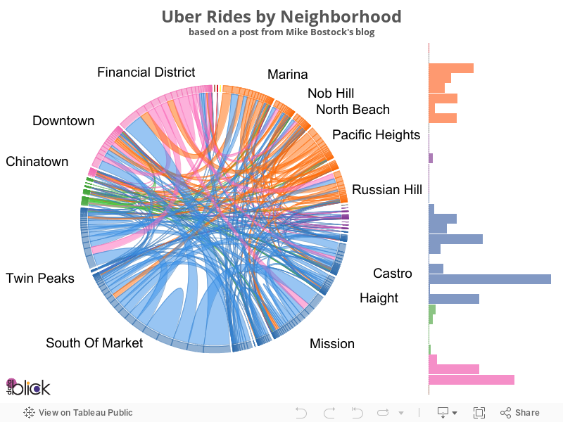
Clear enough? Image from Bradley Voytek’s original post on Uber.
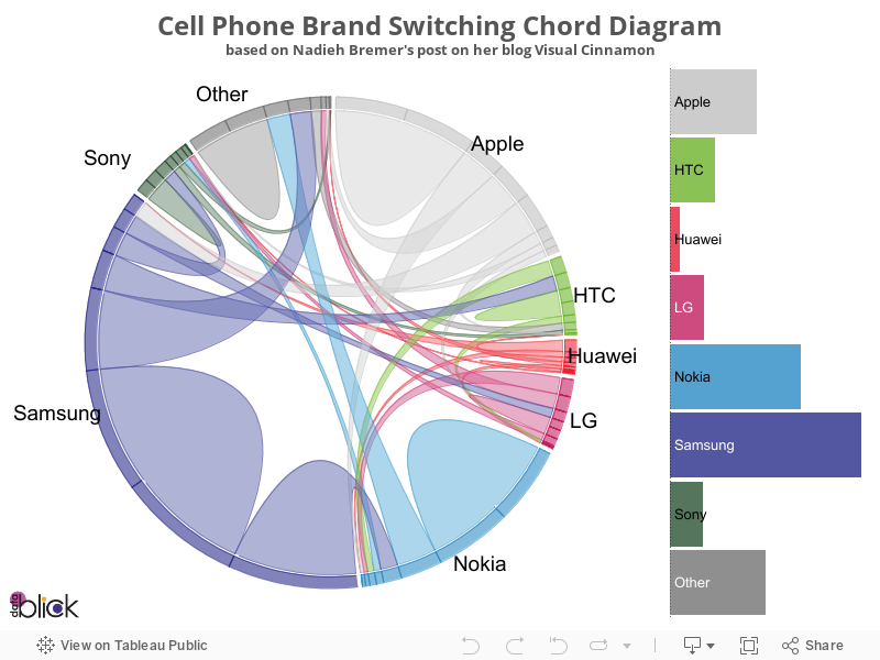
I started with a couple well known chord diagrams, that provided a convenient reference during development. One of my favorites is an example that comes from Nadieh Bremer’s blog Visual Cinnamon. It shows the device choices of a collection of a population that has who owned multiple devices over the course of the survey. Also, Nadieh’s post includes an elegant introduction to the chart type and how it can be used to tell a story. Below is a brief summary of her presentation, in many cases using or paraphrasing her words, this may be sufficient for those who are already familiar very familiar with chord diagrams, and also serves to points out some of the features in the Tableau version that may work a bit differently, for the definitive introduction to chord diagrams I will defer to Nadieh’s post. The second example I’ll provide is based on Mike Bostock’s chord diagram post showing Uber rides by neighborhood in San Francisco which seems to be the most frequently referenced chord diagram I could find. Mike’s chart is a response to a post by Bradley Voytek that appeared on Uber’s site, including the map pictured above.

Nadieh’s headshot looks a bit like a prettier version of Andy Cotgreave’s Kraken.
Chord Diagram Intro:

The boundary, is an exploding donut chart… some folks are going to have trouble getting past that, but I’m not sure the exact percentage comparison of these arcs is necessarily central. I’m not looking to distort data, but when the complexity of the story makes avoiding distortion difficult or impossible, then it becomes a question of how to avoid distorting the story that is being highlighted. I included the volume in the arc as the tooltip (and included a bar chart in the interactive version below). For example, 38.04% of respondents currently own a Samsung (their previous phone may have been anything on the chart, including Samsung).

Individual chords show migration between phone brands. This chord shown here represents respondents who currently own a Samsung and previously owned a Nokia as well as those who currently own a Nokia currently and had a Samsung as their last phone. The arc on the Samsung side spans 8.75% of the circle, which means that 8.75% of respondents own a Samsung currently, but had a Nokia before. 1.2% own a Nokia now, but previously had a Samsung, that means Samsung took gained a lot more customers then Nokia. Since Samsung had a net gain over Nokia, the color of the chord is set to match the Samsung arc.

Some customers remain loyal to their current brand. These are shown as hills on the chord chart, which can be though of as chords looping back on themselves. 9.8% of the respondents use an Apple phone now and also had an Apple previously.

The collection of chords above show those who have an Apple phone now, or who previously owned an Apple phone. All of the chords are the color of the Apple arc, so Apple had a net gain from every other brand. Additionally, with the exception of Samsung, the chords are very narrow at the other end from Apple. That means Apple lost very few customers to these other brands.
Here is then interactive Tableau version of this chart:
The Swap:
Tableau isn’t built for matrix calculations, matrices and vectors would be powerful data types, but building this structure for an arbitrary nxn matrix as it stands is likely beyond my abilities, at the very least, as Joe would say, “the Juice isn’t worth the squeeze.” I chose to allow some minor pre-processing of the data to get it into a tall format, that is, where each row contains data relevant to a single cell in the matrix. There is an app for that… well technically it is an excel plugin. I’ve included an excel workbook at the end of this post which has some step by step instructions on preparing your data to plug into the chord workbook. It is important that the structure and relevant field names match with the samples, or there will be some cleanup required after you plug them in. I’ve done this cleanup 10-15 times myself by now and trust me; it is easier to get this right before you swap out the data. Note, swapping out the data isn’t a technical term in Tableau, I am doing my best to avoid terms like replacing the data source here, since that is already a process within Tableau (and it isn’t a feature that will be used). The process of replacing a data-source involves having two open data sources inside tableau at the same time, essentially substituting all references to one with the other. In this case there is only ever one data source. The change happens when the data source properties, in particular the folder containing the underlying text files is altered, so the visualization updates to a new underlying data rows, but the structure it uses for the visualization is only updated, not replaced.
So say you decide you’d like to recreate Mike Bostok’s Uber Chord Diagram in Tableau. That example is included below, so there is no need to do so, but going through the steps may help to setup using a data set of your own. The excel workbook provides step by step instructions on the pre-processing, depending on the structure of your source data the procedure might be a bit different, but the goal is to get a dataset with the right structure and names, that can be swapped in for the underlying data in the Tableau Workbook. You can attach additional data to rows or columns as desired before of after reshaping the data if you want additional data to be accessible in the view. The reshaped, renamed data should be saved twice in the same folder (I recommend a folder for each Chord Diagram) as ChordData1.txt and ChordData2.txt, additionally, a couple small text files will need to be in the folder, called 2_Copies.txt and 5_Copies.txt these can be exported from the attached excel spreadsheet or you can use the samples attached at the end of the post.
The prep work is pretty minimal. I don’t see much way around the reshaping, even if I was to start from scratch. I mentioned that the data may need to be aggregated to the level of a matrix, and 6 or so fields need to have the exact same names as in the original excel file, though you can always change them back to whatever you like after you swap the data. If that is the bad news, here is the good, once you’ve done that you’re basically done. Right click the data source and select edit data source, then click on the directory for the source data (the red link on the left hand side of the data edit screen) and change to the folder where you placed your files. Double click one of the files to complete the swap and return to the dashboard. That is it… the chords should update to the new data source and you’re done.
In case you missed that, here is a video of how to change the Uber chord workbook into the phone chord workbook in about a minute:
Here is the Uber Chord Diagram:
I promised the underlying data used to create the workbooks included in this post, so here is that, in addition to fueling alternative visualizations of this data this workbook includes detailed step by step instructions on the pre-processing that took place:
Also, here are the underlying twb, tde, and csv files used in this post:
Despite the frequency of the “Can I make this in Tableau?” question on the Tableau forum, Chord diagrams haven’t made an appearance yet in Tableau. I don’t like “Tableau can’t do it”, to be the reason behind ones visualization choices. I’ve spoken with folks on both sides of the fence on this chart type, some feeling that chords should never be used and some who like them for one use case or another. I’m in that second camp, but I’m not trying to sell anything in terms of best practices. Chord Diagrams may present some perceptual challenges, in fact I’m sure they do. In spite of that, however, I have trouble throwing them out as a whole. Some of them are certainly bad, maybe even most, but while these charts can be complicated to look at, they also represent a very complex set of relationships. In the case of migration data at least, I’m not sure there is a perfect choice. But I guess we will see what Joe comes up with.
Don’t forget to send me your Tableau chord diagrams! I’m going to stick them all on the fridge.
